
ROWA Masterbatch reveals the color trends of the future
14.09.2023
Pinneberg/Germany, September 2023 – On the subject of color trends, thoughts involuntarily drift to the catwalk - clearly, because colors and color effects play a particularly significant role in the fast-moving fashion industry. Yet color trends also have a considerable influence in many other industries and areas of life - from cosmetics packaging, automotive and E&E applications to numerous lifestyle products for everyday use - where they play a major role in purchasing decisions. Luckily, color expert ROWA Masterbatch is already aware of which colors and effects will be in vogue in the spring/summer season of 2025!
Taking the WGSN's trend color view as a basis, ROWA Masterbatch, in cooperation with effect pigment manufacturer KUNCAI, has once again this year created interesting, vibrant and unique nuances of the trend color tones from different corners of the color palette. Along with the pur tones of the respective nuances, one tone elaboration has been developed that reveals dramatic color effects and another that attains just a subtle change in the base tone.
Drawing on KUNCAI's broad product range and its own core competence in the field of synthetic mica effect pigments, ROWA Masterbatch has developed color-intensive, pure and - depending on the viewing angle - varying color formulations with high-quality and unique effects. These effects enable end products to make an impressive impression in the trend color environment and product properties gain a high profile at the point of sale due to the trend-adapted coloration with a "multi-effect".
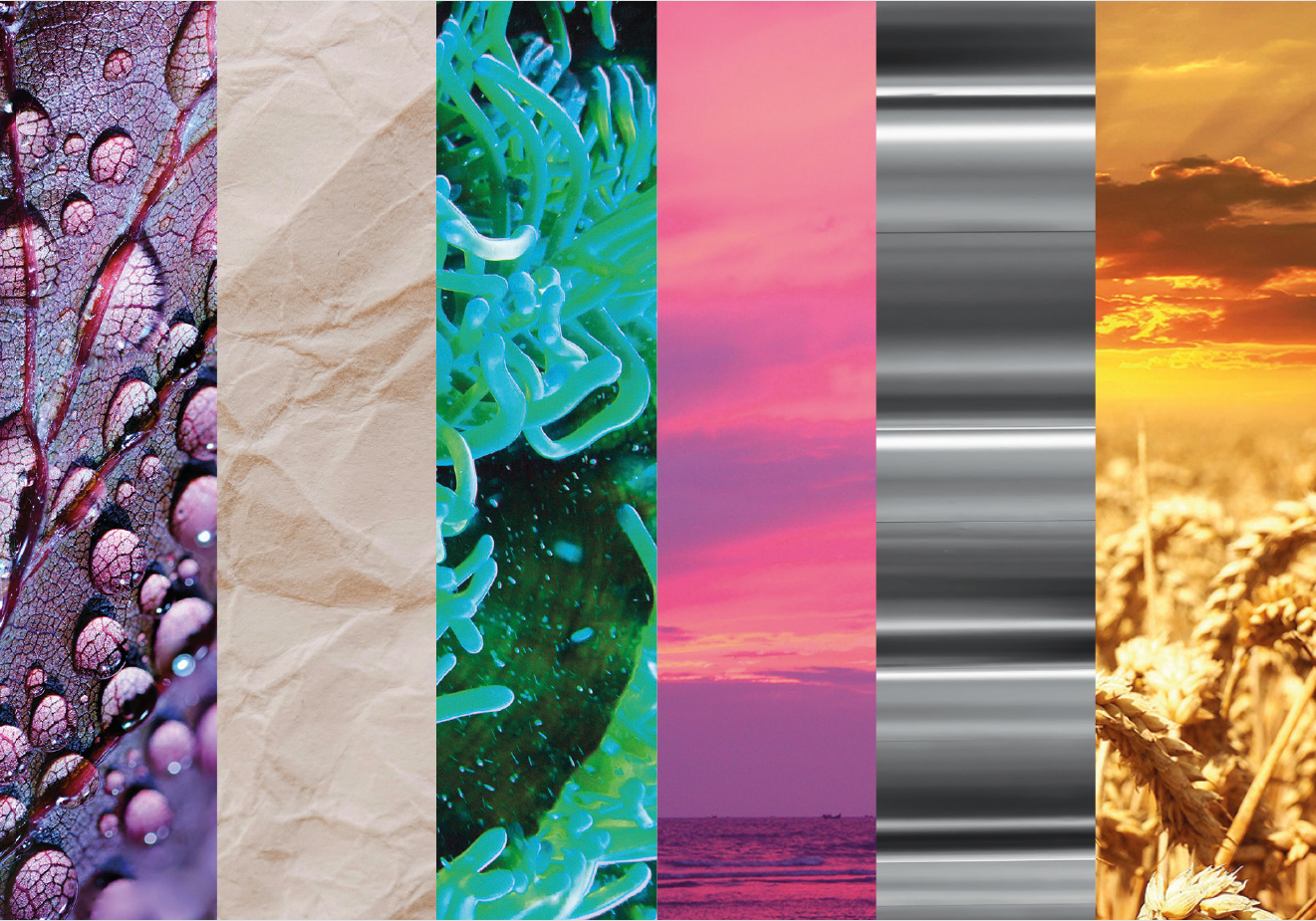
Trend colors spring/summer 2025
Future Dusk - Color of the Year 2025
Future Dusk is a dark, moody and intriguing hue situated between blue and purple that carries with it something of the mystical. The theme is one of transition and change - whether it be moving from dark to light or from dusk to dawn. The hue involuntarily evokes a celestial appeal, making Future Dusk sure to generate a great deal of interest in innovative tech-driven gadgets. The effect pigments used are a dark purple, representing luxury and grandeur and an interference pearlescent pigment, which creates intriguing alternating colors depending on the perspective from which it is viewed, lending a sense of excitement to even the most unassuming items.
Transcendent Pink
Transcendent Pink is a barely-there hue that is more like an elevated neutral tone giving it a grounding and balancing character. This color is already found in virtual worlds - by the spring of 2025 at the latest, it will also be increasingly found in the real world. A sense of calming stability underpins the tone, something that experience has shown consumers are looking for in challenging, crisis-ridden times like these. Moreover, as a versatile color, Transcendent Pink lends itself to a wide range of applications and products across genders, demographics and seasons. Using interference red pigments, the colorists here have created a glittering pink that is guaranteed to meet with a great deal of approval and not just in the cosmetics sector.
Aquatic Awe
Aquatic Awe embodies an exciting duality: In one sense, this transformative turquoise celebrates the fascinating aspects of nature and is reminiscent of bioluminescent marine life, in another sense, the hue also represents synthetic and digital themes. Whether used as a home accessory, in cosmetic packaging or automotive interiors, the prospects of encountering Aquatic Awe in the future are numerous and high. The use of various blue and green effect pigments creates an exceptional, extraordinary and captivating turquoise color.
Sunset Coral
This shade is an energizing feel-good color, an intense sunset hue that encourages focusing on the positive and represents the growing importance of escapism - themes that product designers are certain to embrace by infusing their objects with a sense of wellbeing through Sunset Coral. Pearlescent pigments with color flop create polychromatic effects to reveal different colors - resulting in breath-taking hues that can be combined in one and the same product.
Ray Flower
Ray Flower is a radiant and warm yellow. This color has an inherently optimistic and wholesome quality that is associated with a focus on action towards a more sustainable existence. This color hue is also linked to the lunar eclipses that will take place in 2025. The prospects of success for Ray Flower are most certainly not dark at all - who wouldn't want to be surrounded by such a positive color scheme? Indeed, the use of various shades of yellow and gold increases the impact even further: The effect pigments used give the color an intense shine and consequently lend the item in question a particularly luxurious appearance.
The ROWA Masterbatch team will be presenting sample plates of these trends at the upcoming Fakuma.